Monday, November 29, 2010

Tuesday, October 26, 2010

Monday, October 25, 2010

Paper doll cut outs


last assignments

journals? Leather bound?
Booklet inside a transparent envelope?
FRONT BACK AND SIDE HEADINGS
Don't have to print back and front, can stick together, but make sure that it isn't too thick - less than 200 gsm
name in assignment.
Detail in everything, very cohesive.

Monday, October 18, 2010

DDS for assignment

COLOURED - right scale. Zooms are important if you can't see things.
Create your DDS to your strengths, either Illustrator or hand drawn.
A4 template - DDS on A3 template, so you can put all the details in. Then put it back to small!

Next week - mock up of how you're thinking that your catalogue will work.
Visual diary
Synopsis
Fabric manipulations
have a printer!

Can only help in class times.
Printer here and downstairs - always talk with them about when a good time to print is.

Assignment

Hand in date - Monday the 15th of November!!!!!
Not the 8th, I mean the 15th.
But come to class, figure out presentations.

This brief goes for both Michelle and Lea.
This assessment is worth 40% of this whole subjects mark - 20 for Lea, 20 for Michelle.
Not designing fr subculture, influence for another market. Synopsis with concept board is also in catalogue.
Hand rendered or digital?
Focus on manipulations in rendering. Bring fabrics to class.
Everything drawn by hand has to be scanned and cleaned up before it goes into the catalogue.

All catalogues will be so different, have to speak to Lea.
1 collection view - garments all on the one person, making at least 2 looks.
Range drawing MUST be hand drawn, but not hand rendered.
Don't forget that a draft print has to be done.
garment descriptions for each. Garment style numbers.
No bigger than A4, no smaller than A5. It can be huge, but it has to fold down.
Don't forget, think about ways to hand this in, box, bag? It has to be pretty.
NAME on this.
Little details, make this believable.
Demonstrate an understanding of the overall topic.
DDS totally coloured in, no black and white!
Bring diary to class.
Keep the catalogue tips and tricks handy at all times.
Bring to class - there is a checklist on the back - plan a date for printing, where you will print.
mock ups every week for the next 3 weeks.
come next week with an idea.
Source paper weights and types - sheer has a tendency to melt so be careful about where you source it from. AND THINK ABOUT WHAT WILL BE ON THE NEXT PAGE! Creates depth and excitement, but is also a bit tricky.
If your printer won't do this page, you could always do it at home? But don't do an important DDS or anything at home.
Colours used in catalogue - representation of concept. Catalogue has to theme. Colour paper? Do so many test prints that your head explodes. The colours will come out incorrectly.
Fonts - no more than 2. That's all.
Don't distract from DDS with silly fonts.

Monday, October 11, 2010

complicated catalogues

crazy shapes? divide it into sections. Bleed, safety, crop marks. calm down.
We can't draw artboards in whatever shape we want.
One layer is bleed, one is guides and safety.
Draw bleed around your crazy shape - copy and past shape and make it bigger. It doesn't have to be exact, just bigger. Do the same for your safety. This means we can lock, show or turn off.
crop marks - these go in the bleed.
do NOT do this front and back. Just don't. Just put something not important on the back.

Concertina fold catalogue

Files - HOW DOES THIS FOLD?!
is it a poster that will fold into itself? Concertina? Something you make up yourself? Figure it out on scrap paper.
3 mm bleed
5 mm safety
fold marks
add 1 mm for each fold mark.
add the amount of every fold onto the measurements, eg 5 folds, add 5 mm.
set the front and back up as separate files.
can be nice to put a little extra on the front so that when you fold it up it comes together without seeing the inside bits.
Crop marks - add when you save.
if you have thick card consider that you'll need extra room for the fold.

think about how it will look when it folds in on itself. DON'T WANT IT TO BUCKLE.

bound booklet

Before we even start the file - How will it be bound? Ring bound? Stuck together? Sewn?
Measure bind allowance.
Add bleed and so forth. Add measure for how big the bind will be.
AND REMEMBER NOT TO PUT IMPORTANT INFORMATION HERE.
reverse bind allowance for the other page.

booklet

creating a booklet
2 ways to do this - stapled, just pages folded.
when starting with the files, it's good to have something to base it off - can touch and look - fold a4 paper to make the book. How are we going to lay the pages out. How many pages? Remember that it will have to be even numbers - remember the front and back.
Front and back are the first files we make. Others are later.
When you do this as a practice number each page so you can work out how it fits together.
back/front pages
1 and 14
13 and 2
3 and 12
11 and 4
5 and 10
7 and 8 - middle pages! thus next to each other
9 and 6

Booklets - yes, it's the easiest to print. But you have to do a bit of setup. Once we have one done, this is the only one we have to do. But remember to put page numbers in.
"Pagination" - how the pages are formatted. Have to think about what it will look like on every page turn. TEST PRINT!!!! Do it.

Also - don't forget to put the bleed in AS YOU MAKE THE FILE. Add 1 mm extra in to make each of the folds. And add in fold marks so that you know where to fold - we put these in also at the start, in the bleed area.
Make sure you set each page up as a separate file so that it doesn't crash! Name the files - page 1 and 14 eg.

Now we come to the front and the back. we have the bleed and the safety line, and the fold mark. What else?
this has to fold around EVERY PAGE - so think about how much you will have to put in at the fold so that you have it covering everything properly. We want to JUST see cover. so add 3mm at the fold.

Cover - add to to 3 mm of bleed. BUT DON'T MOVE THE SAFETY LINE! Extend this at the sides. you just want to make sure everything is in your lovely booklet.
Decide on paper!

Givenchy Spring 2010


Saturday, October 9, 2010

A little glam.


Hot tramp, I love you so.

Monday, October 4, 2010

Fabric feelers in illustrator


This is easy. Huzzah!
File - new - keep menu up. This is where we will make all of our changes.
Remember that you can always change this afterwards. You don't have to worry about expanding or whatever.
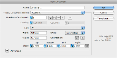
How to print without the white border - Have to figure out the size of our print. The only way that we can do it without this is to cut it off. When you've set up the file correctly you put in marks to show yourself where to cut.
To do this - we make our images bigger than they have to be - as in, if we want A4, we print A3.
Oversize A3, and cut to A3.
Make the artwork go a little over the size. Add a bleed.
Bleed - 3mm to 5 mm - artwork has to extend to the edge of bleed.
Cut line is next. And we also have a safety line where all text has to stay - otherwise we run the risk of cutting off letters of important things.
To add this information in is easy. Every printer and illustrator knows about bleed.
We can add this in when we make the file.
Make sure we do this at the beginning. It just saves time.
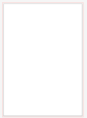
Printable area is within black, but we make the image as big as the red outline
Bring a ruler to class from now on.
This size is A4 - I want to make this landscape - use artboards - this shows us the centre point. View --> show rulers - drag and line up with centre.
Landscape tool is at the top.
Add an extra 5mm to the centre so it can fold over - length will be 15.5 x 12 as finished flat shape.
At the top right in artboard I can type in my size.
Now we think about fold - front has to be a little bit bigger than the back.
6.1 for the front.
To change 0 - drag from top right corner to where you want it to be.
Make marks of where we want this to go - use pen tool on black outline in bleed section - this way it won't be visible once we've cut the bleed section off. Make sure the mark is on both sides.
Remember to put the artwork to the back, otherwise we won't be able to see our lovely and important marks.
Don't get rid of fold line, but you will have the lovely marks when you print. This makes it easy for yourself.
This helps us to remind ourselves of where the front and the back are.
This can be used over and over again. Save it as a feeler template.
Top is the front, bottom half is the back. Don't forget that the writing has to be the upside down for the front!!!!!!
Now we are close to finishing the file.
One thing left to add in - the safety line. This is purely done with guides, just as a reminder to yourself. Make safety inside the black line at 5 mms.
Now we know that this is where the artwork goes.
And we are safe!!!!
Print feelers one to an A4 page.
When you go to do the files, set them up the same way.
Save out each layer with the background as a PDF, as we did with the earlier projects.
We can add in crop marks after this - it only adds crop marks to the corner of the artboard.
When we are saving, make sure you choose the amount of bleed - eg 3 mm.
Check - crop mark, colour samples, registration marks etc.
Fold before you cut!

Week 9

And in we go - Bricolage.
Keep your eyes peeled for interesting catalogue ideas - we have 3 weeks in class to work on this.
Now we get to complex file setting up. Hooray!
But before this, think about file management - a little different to folder, but the same elements.
Assessment 3_catalogue - inside this
Template - this folder has all our templates - mostly stuff we set up in class - layouts for catalogues etc.
Today we will set up fabric feeler template. We can keep using this. Fabric Feeler file.
Catalogue File.

Within Catalogue we set up some more folders.
Linked files
Photoshop files.

In "fabric feelers" folder we also need linked and photoshopped files.
We also need a PDF folder - in the main section for finished work.

Also - another folder for research
One for Drawings - images and scans

Now we should have everything we need. So we don't loose any information.

Concept board - A3 and mounted.

Saturday, October 2, 2010

Monday, September 13, 2010

possible poses?


After holidays - one enormous lecture - gives all the examples of everything we need for catalogues.
Last assignment is a combined assignment - bricolage - we are presenting a catalogue. One hand in, marked by every teacher.
For holidays - collect every type of interesting catalogue you can find.
Not necessarily fashion. Just anything nice.
Each page with themes. All these catalogues go into the visual diary.

DDS

it's going to keep coming back. Death.
But - doesn't have to be digital, or hand drawn, or a mix.
Use - pen tool - for digital drawn dds.
It's also OK to trace hand drawn designs, or trace draped designs you've done on a mannequin. Very acceptable.
Can get the right proportions, layer into shapes, looks exactly the same.
OR - live trace.
Not necessarily a black and white image, can be anything.
if you have a hand drawn dds and you want to make it digital, clean it up, make it very highly contrasted. Place file in illustrator, click with lack arrow. One of the options on the top is live trace. This creates a vector image.
Make sure it is VERY clean.
before you can manipulate it in any way, expand strokes, this gives us the paths.
Expand is also just along the top.
Now we have a vecotr image! Can colour, change outline colour.
BUT - this is grouped automatically. So ungroup first off.
Also - when live tracing it cuts through all of the layers, it divides the shape. Make sure that every edge is joined properly.
if we have bits on the side that don't join up the colouring won't work. So what do we do? Well..
we make a shape and sent it to the back! Then we have to colour without having to go through the joining hassle. But actually we do this at the end anyway, so why didn't we do this before? I don't know.

There are several types of tracing we can do - click to the right of live trace, and there are many options - a bit like filters in photoshop.
live tracing takes a lot of memory.
eg, photo and so forth - expand, we have a jpeg photo that is now vector.
Can choose - max colours - simplifies down to 2 coloured artwork.
Remember - that it's good to keep bodies and clothes separate, so we can layer the bejesus out of it.
From here - we have to expand to do anything. In a photo it will go wild.
So - next assignment gives us a choice - blend drawing and digital. We are marked on designs and presentation skills - and how we communicate these designs.

lessons learnt

colouring zipper
expand brush stroke, just have to remake.
You can't make a brush with a gradient.
lines on the pdf are normal and not anything to worry about.
macbook pros often have trouble saving as pdfs.

http://www.kareenazerefos.com/art/


look this girl up for illustration

Monday, September 6, 2010

Photoshop rendering

delete unessential in illustrator, make a black box outside of the DDS without fill.
Copy and create a new file in photoshop and it will be exactly the box size.
Don't forget to get rid of black lines.
Delete the white areas.
When we copy in it will be huge, keep bringing down, then move fabric layer underneath the DDS layer.
Duplicate many a time.
and so on.

Printing


We have everything put up on out artboard - black boundary. Put my artboard on top and we are ready to go.
Don't "Save as pdf" - will be friggin' massive, saving links in etc. You don't want this.
Printer will only print with pdf. Grr.
Can open PDF with illustrator and continue changing moving etc.

Use file--> print
Adobe postscript file is a pdf.
Wow.
1 copy, all or range. This relates to artboards. Whatever we see is the one that will print.
Don't have to scale, just select fit to page, can change the orientation, all normal printing stuff.
But choose save, go into finished PDF.
Save each one separately, and we will collate at the end. Week one skirt, print--save as pdf, save in file, etc and so on.
Eventually we will have many pdf files. ALSO - we want a title page.
Then we select each of these pdf files. These need to go into one pdf - requirement for assignment.
Use adobe acrobat pro
This will combine pdf. When you open nothing happens, except it comes up as adobe.
File --> combine --> merge files into a single pdf.
Super. Drag and drop all into this window. Don't worry too much about the order, you can change them now or once the pdf is created. Move up, move down. Etc. Combine files, click, and we are all happy.
This doesn't delete files, just creates a new one. Asks you where you want to save and what you want to call it.
If you don't change it then, when you open the pdf, hover mouse and drag it etc.
If you realise that you left a page out, right click, insert page, click on this and select the one.
Can delete pages, can rotate etc.
Easiest to put page numbers in in the pdf.

Don't have to go wild with printing, just do it off the home printer.

Colours/rendering


Black and white and colour and photo - this can be presented however you want.
White jacket has to have darker background.
Formal jacket is grey.

Rendering techniques - easy ways of colouring in artwork.
Group all DDS when you're finished, this will make everything a lot easier.
Don't have to send a ridiculous amount of time on rendering, if it's grouped select --> same -->fill colour. This selects everything that has the fill. Only works if it is grouped once.
Same thing to change outline - select/same/stroke colour, then change colour.
Use 50 per cent grey scale for outline of black garments.
Have to be sure that your fill and outline are grouped. Don't just click on DDS once.

Gradient colour - window --> gradient.
Can move gradient knob up and down, change ratio of grey to black, can change direction, angle at which the shadow is cast.
To change colour - double click on square, can change colour on either side.
Swatch library - doesn't have to be on disc, but can be nice.
All pantone swatch libraries are available.

Is there a copic swatch palate?
But pantone solid coated is the one that we like. Mmm, we like.

Drop shadow - this raises from the page a bit, which is cool.
Click into group, Effect -->stylise --> drop shadow, preferences available about colour etc, but default is fine.
Be aware that you can't layer the shadow on the DDS, it will go an ugly colour.
Don't drop shadow each individual object if you are layering them, group and shadow all.

If something is white, make sure you have filled everything in properly, has to be filled in white and THEN drop shadow. Otherwise it will put shadows on every outline and be ugly.

Linked files

Each file you make in photoshop has to be placed into linked files folder - every time you put these in you create a hyper link. When you save for web and devices, save into linked file.
Linked file has to be close to the library file, otherwise when you change computers it won't be able to display it.
Every time you place something into illustrator you break the link.
Replace, ignore, or cancel.
Select apply to all, replace, select the file you want.
If you change something in photoshop and you save on top of the linked file it automatically updates the illustrator file.
Links palate, window --> links shows you every link that is in the presentation.

Final


Presentation techniques, saving as PDF, etc. This is big.
On UTS online there is file management stuff with how to put everything onto the disk you have to hand in. Look this up.

Presentation file management - use the same file for every presentation. Copy and paste.
New folder on desktop to be template - presentation file template - 4 folders to start
Photoshop file
Linked files
Finished PDF
Library

This is what everything has to be presented with - there is a neat little compartment for everything.
PDF - each page that you will print in presentation - folder
Library - swatch library, symbol library, brush library
Linke files - files saved for web and devices out of photoshop, also image files - anything that you will place in Illustrator goes in here, all images of garment, gif from photoshop.
Photoshop - all the rendering folders, anything that you need to save from photoshop.
Illustrator file also goes into this section.

Create new Illustrator document, save into template folder at the top - this is the working file.

Nest - actual presentation file - copy and paste each garment into a presentation file, black and white DDS and coloured DDS with photographs, week by week layout.
Every page is a different layer.
Can make a fancy background layer, keep it on and locked for everything.
Start with a new file - have to think about size and so forth. Can have 2 printable pages in one file or more.
Artboard tool, choose A4. If you want another you simply put it on top of this, choose the size.
Can do each of these artboards on the same layer.
Remember to click on button next to artboard one, copy and past whole artboard with the artwork.
Can type in a size and it creates them as you want it.
However, just se a different layer for every artwork.

LABEL front back and side. Always. Has to have headings.
Artboards done.

Friday, September 3, 2010

The birthday suit


I almost forgot how much I love this stuff - tricky searching for this on google.

Undo reform stuff

Then


Now

Recent


Monday, August 30, 2010

homework

Ana Guan

casual jacket - denim, puffy, parker.
Also an accessory.
Go to, son!

Drawing jacket in class


Has to be step by step
Base step and then add to it so - collar and actual shape of jacket.
Sleeves sit behind, but everything else is floating on top.
Don't forget jacket shadows - these little details are important.
Make a shadow shape and put it into the symbol library.
Notice - cuff uses clipping mask. Doesn't matter what stripe is in it, but can just do it in illustrator.
Good for DDS - has contrast of rolled up sleeved and long sleeve. Show each of these views.
2 separate front views.

New - zooms!!!!
Doesn't have to be hand drawn any more to show little details.
Just copy and paste whole garment, do a circle and make a clipping mask, then enlarge and now you have a zoom.

Have to make an illustrator striped shirt!!!!!!!
This is the last week of drawing and homework.
Have everything finished by next week.