Tuesday, November 1, 2011

Monday, October 24, 2011

Booklets

How to save as a file - exporting illustrations as jpgs - do this for all illustrations - high resolution.

Saving our files with printing marks - make sure all artboards are the right size - file --> save as.
research - 6 pages - technique 1 - up to 12 - tcnique 2 - up to 12 - save as pdf. If there are extras you don't want, make sure to delete them before you save
press quality - marks and bleeds - select all printer marks. use document bleed settings. Then hit create.
At the end, we combine all the pdfs into adobe acrobat pro - file --> create --> combine files into a single pdf.

Monday, October 17, 2011

if areas of detail are destroyed by the smudging, return detail - details like remembering to paint within lines - showing different opacities of brushes - show a demo on editing your brushes

Changing A3 image to A5

Keep A3 document - file --> export - then save as jpg - this is because it compresses all of the layers into one. This is also recognised easily by photoshop. Remember, when you export, it takes from the edge of the image. Remember to have a background.
Remember that this picks up everything - even those outside the artboard - so delete everything from background.
Import into photoshop, edit image size, save as A5 148 x 210 with 3 mm bleed, then when we place into illustrator, it fits perfectly onto page.
This keeps the size small.

Photoshop brushes

Moving between photoshop and illustrator. Brusheezy - good for pattern brushes
Using a photoshop pattern nto fill a shape in illustrator - place in image from photoshop, send to back, select figure and background, and make clipping mask. This keepsw background image in the shape. PRoblem - if I hover over, you see the size of the original image - is often going to make the file very big.
Or - can do the other way around, and bring the opbject into photoshop - select vecto outline, give a low stroke weight, copy and move into photoshop - keep as smart object - this keeps the vector qualities - can scale.
Hit inverse, delete backgroun - now I can move this smart object layer without the pattern being a problem.
Photoshop brushes - can combine 2 together to add depth - more flexible than illustrator - put in booklet how to make brushes! Go into window brushes - can go and manipulate any that you like, take into brush and give it more bristles? etc change shape, change flow etc
Tips - soft brushes, fill in light first, then move to darker areas.
Use dodge and burn tool - dodge can lighten areas -can choose midtones, highlights etc - can alter strength. Burn tool does the opposite.
Can change brightness in the image with curves - this effects the whole image

Monday, October 10, 2011

Need start of document by next week

Gradient mesh


Gradient mesh - framework that we move gradient on top ofd
Decide how many mesh points you want - use mesh tool - jusat above gradient -
apply mesh tool in several areas, doesn't look like much until we apply colour. Can change shape of mesh with white arrow.

Select anchor point and apply colour, gives a gradation of colour - should blend smoothly.
Mesh tool can also be applied to a line, but you don't have as much control - hover mesh tool over line and then pull it, and play with colours etc.

Monday, October 3, 2011

Rendering skin - tutorials

http://www.imaginefx.com/02287754332606896693/tutorial.pdf

Patterns in illustrator


Select swatches - top left drop down menu - open default illustrator swatch menus - each one that you use is automatically put into your swatches palate, at the end.


If we download any patterns, you can apply in the same way.
Remember that as you move the shape around, the pattern changes.
If you want the pattern to stay the same within the shape, this is under transform.
If I want to rotate a pattern within a shape, deselect object. If you want the pattern to not move, deselect object. Can also change scale - as it's vector, this can change to any size.


Other way to edit pattern, click on swatch, drag onto artboard. Ungroup (object ungroup) - from here can change colour, positioning etc. Invisible box around keeps the pattern working. Select everything and drag back in, or go edit --> define pattern - name it, then apply however you want.

You can download shapes and turn these into patterns - first take image into photoshop, turn to CMYK - go to image size, check off resample image. Then save as jpeg, and place as normal.
To turn this pixel based image to symbol, rasterize - go for transparent background - then we can edit-->define pattern. This uses boundary box of your image for the boundaries of the repeat. If you want more space around the edge of your image, you would need to draw a clear box around your symbol. The box doesn't have to be transparent, but you would need to make sure that you have gotten rid of the background in photoshop - and it would then need to be placed in illustrator as a png or tiff file.

Remember that when you're doing patterns in illustrator, it just does a grid repeat - often leads to lines around your pattern. This can be fixed by special repeating patterns.
If your shapes are unevenly distributed it has a bit of a strange repeat. Doesn't give a consistent band - remember that the shapes aren't repeating, the bounding box is. The furthest thing is the one repeating. When you have the pattern you want, make a box WITHOUT stroke or fill around it, then use divide, then ungroup.
Go to window -->pathfinder - bottom left - called divide - What this does, if you have overlapping shapes, it will divide them where they intersect, need to ungroup to see the effects of this. This divides up the circles that are out of the bounds, you can then place them so that they repeat nicely. However, doing this by eye often gives white lines where repeat is. Can use the align thing to align to left or right.

Book

Remember not to go too text heavy - use different colours?
With symbol tool examples, use hue and saturation first, to make it different?
Basic ideas of how to use first, then how it applies to your illustration.
Think about putting inspiration pictures in, of other illustrators who have used this technique. Put in references of good websites

Wednesday, September 21, 2011

New assessment - reference pictures


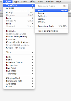
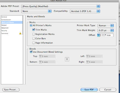
Undecided about which of these to use for symbol techniques.
Leaning towards the safety pin dress.

This for my photoshop brushes technique.

Monday, September 12, 2011

Design Chapel

http://cargocollective.com/designchapel#16534/Fashion-illustration-2006
Photoshop brushes - want to try this, especially on the face! Subtle and slow, I like this.

Illustrators

http://designcollector.net/esra-roise-illustration/
Esra Roise - tools I could use for this sort of thing in illustrator - pen tool - for the tracey lines. Brush tools - splatters with brushes

Task 3 - ideas

Collage - for garments? and faces?
Brush tools for skin?
Pen tool - outlines? tracing?
symbols?

Retouching in photoshop

Remember with screen grabs, zoom in as far as you can - largest possible images.
Look at Glen Feron - retouching for advertising.
Remove crease and patch lines from scans, smudges from hand on paper etc.
These techniques work for anything with lots of detail.
If it's an original, make sure that you save an original copy.

Zoom in very very close - under bandaid - healing brush and patch.

Healing brush - get a big brush head, go and make it an appropriate size to what you're retouching. We also want an oval rather than a circle - drag anchor points in to make an oval - the circle can be too obvious on skin etc.
Zoom in further, but it matches the colour to the surrounding colour. Blends in with background colours.

If you want a bigger area, use the patch tool. Select an area that you want to replace, hove mouse over area, drag it to an area of the same pixels that you want.

There is a dust and scratch filter - filter --> noise --> dust and scratch - this blends any abnormal marks to the background.

In adjustments, cnage contrast between highlights and shadows. Bring up tone of paper by playing with levels. Make sure that the levels are a different layer, very hard to get back to what you started with.

Getting rid of red eye - at the bottom of healing tools - just click on the centre of the pupil, and it will change this.

Photoshop brushes - work in a similar way to illustrator, but they are pixel based not vector. Can't scale to be bigger.
Brusheezy - good site.

Opening a new brush library - ask to append, it adds the brushes on rather than eliminating the brushes.
Edit any existing brushes by opening brush presets and fiddling - size, orientation etc

Task 3

TASK 3 | Digital

The aim of Assessment Task 3 is to create a comprehensive fashion techniques catalogue that showcases research and visual examples of TWO chosen Illustrator or Photoshop technique covered in class. The content to go within this catalogue will be gone through in class and include written and visual elements of your own development. You will continue to work in Illustrator & PhotoShop to create and manipulate imagery and lay it out in Illustrator where you will build a document to export as a press ready multi page PDF. The format of the catalogue is A5, 12 pages max per technique and to be professionally printed. This will be arranged in class with cost details to be provided shortly.

You will need to:

Research and Plan Your Concept.

Select TWO of the techniques covered in class or select several of your own choice. Examples of possible techniques may include brushes, patterns, symbols, patterns etc. Consider how you wish the viewer to experience your catalogue and how your chosen concept would best be presented in this A5 format.

Use ‘flow’ thumbnails to help visualise the layout of the document Decide on the amount and type of descriptive annotation to be included

Demonstrate competence in specific skills and techniques taught in digital workshops

Inspired by your chosen research area create visuals and two illustration im- ages that show evidence of the techniques you have showcased. Imagine you are explaining how to use a certain techinique to someone that is not familiar with it. Use visual examples to support your written instructions.

Clearly communicate your designs and personal style using digital media to show off your fashion designs and personal style

Consider ways in which you can make your documents user-friendly while retaining a high level of professionalism by utilising consistent navigation, clear layouts, easy-to-read text, spell checking, choice of content

OUTCOMES • Clarity, insight, articulation and presentation of chosen design • Appropriateness of catalogue layout • Visual effectiveness of typography and graphic handling • Communicate concepts clearly and effectively throughout your design • Class attendance, professionalism and ability to meet scheduled deadlines • Presentation of printed material and management of digital files

SUBMISSION DATE: 12.30am Week 14 ASSESSMENT WEIGHTING: 50% of subject grade

SUBMISSION REQUIREMENTS - press ready pdf files of printed work

- Submit files on CD and to the Dropbox

- All print copies, CDs and files must be clearly identified with your name eg. 2011_lastnameinitial_task3.pdf

- Do not burn your CD until the final checking, completed in class, has been completed and any errors remedied

- PDF multi page files must be under 20mbUTS 83344 F&T: ADVANCED DRAWING & DIGITAL MEDIA

SUBMISSION DATE: 11.30am Week 10 (30th March2011)

SUBMISSION REQUIREMENTS - printed A3 exhibition poster - press ready pdf files of printed work - digital multi page research PDF

- Submit printed work in an A3 plastic sleeve

- Submit files on CD and to the Dropbox

- All print copies, CDs and files must be clearly identified with your name eg. 2011_lastnameinitial_task2.pdf

- Do not burn your CD until the final checking, completed in class, has been completed and any errors remedied

ASSESSMENT CRITERIA

- Clarity, insight, articulation and visual effectiveness of PDF research document

- Visual effectiveness and technical competence of A3 poster

- Communicate concepts clearly and effectively through a process blog

- Class participation, professionalism and ability to meet scheduled deadlines

- Presentation of printed material - Management of digital files

ASSESSMENT WEIGHTING: 30% of subject grade


NOTES


Pick 2 techniques that you like, that fit with your visual style.

Max 12 pages for each technique, no minimum.

Text should be simple, point form.

Going from start to finish of using a tool, think about how clear you can make this.

Use image that you create as a reference for the technique you're doing.

For next week - choose techniques. Find reference images - make sure this matches the technique you want to do.

Distortion, brushes, gradients.


Monday, September 5, 2011

Saving multi page pdfs from illustrator


Save as pdf - check press quality, untick illustrator editing capabilities - adds heaps of size to the folder, which we don't really need. The illustrator file is still there, so we don't need to be able to edit the pdf.

Don't forget bleed and printer's marks.

Remember to make sure it's in CMYK - it will show up at the top of the page. If it's RGB, change it through file document colour

Multi page PDF - if they're out of order, we make it look like it will when it's done. Pages are out of order, open with adobe acrobat pro - same but white instead of red. Click on the page thumbnail at the left, click and drag to change the order.

You can delete pages, add extra files, edit text, etc. Click on tools and find edit.


If files are too big, either flatten image, merge some layers. Otherwise, it could be the brushes - can rasterise these, which makes them from vectors to pixels. Remember that this can't be reversed, so only do it at the end, and always save a back up.

Tuesday, August 30, 2011

Monday, August 29, 2011

Saving in photoshop --> illustrator

Saving as a tiff means that you can transfer without the white background. PNG can also do this, but it's more for internet. In tiff, when you save, there is an option to save transparency. Tick this box, and when you place it into illustrator it will not have the white outline.

If you have a layered photoshop document. save it as a psd, making sure that the layers mode is ticked. When you place this into illustrator, DON'T PLACE. Open directly into illustrator, options, convert layers to objects. Default is to flatten image, but if you need the layers intact do it this way.

If you're transferring a vector image into illustrator, if you paste in as a smart object, you can continue editing it. When you double click on this object in photoshop, it automatically reopens in illustrator, can change it there, and when you save it, this automatically changes in the photoshop.

Monday, August 22, 2011

Creating symbols, gradients and blending modes.

Matching colours in a subtle way, going for good blending - for gradients

Use symbols of round rectangle etc

Use effect --> convert to shape\
path - the same as those under object path
Effect --> warp - very useful for industrial design.

Distort and transform are the most useful. Free distort is like free transform in photoshop.

Preferences - scale stroke - go into -object --> path and outline stroke

Roughen - very abstract

Pucker and bloat - pucker changes anchor points

Gradient - can be radial or linear - this is good for the colour of the eye.
Remember for eyes, not to go too round - don't forget the eye lids!

To change colour of gradients, double click and change, decide how many tones you want to blend between. To get rid of a colour, just click and drag. Gradient sliders indicate the amount of colour.

If you want a highlight, use white in the middle and make it a sharp gradient

Blending modes - 2 shapes, select both - object --> blend --> make. This blends one shape to the other. This can be released in the same place. Can got to blend modes 0 go to smooth, can decide how many steps you want - more steps is smoother.

Friday, August 19, 2011

Tuesday, August 16, 2011

Artist bios - just in case

Name and bio - Tim Walker, (born 1970) is a London based photographer. His interest in photography began during a work experience, where he coordinated the Cecil Beaton archive. Walker studied at Exeter Art College, completing a BA (Hons) degree, and after this worked as a freelance assistant, notably working under Richard Avedon. His career was launched through the Independent Young Photographer of the year award, and he has since shot for Vogue, W, and Harper’s Bazaar, as well as advertising campaigns, including Comme des Garcons, Yohiji Yamamoto, and Dior. Walker’s works are on display at the Victoria and Albert Museum and the National Protrait Gallery in London, in their permanent collections. His first major exhibition was in 2008, at the Design Museum in London, coinciding with the release of his book, pictures. In the same year, Walker received the “Isabella Blow Award for Fashion Creator, and in 2009 he received an Infinity award from the International Centre of Photographu, and in 2010 won an ASME Award.

Describe the chosen artists visual style? Walker’s styles has a very distinct fairytale feel, with a magical and eccentric charm. The images are highly evocative, and create a surreal and exuberant environment in which the garments are showcased. Walker considers his signature to be in extravagant staging and romantic motifs.

What materials and processes are visible in their work? Walker uses entirely constructed and elaborate sets, without using digital imaging to create the surroundings. The sets are instrumental in creating the surreal atmosphere, and Walker is careful to choose models who are able embody the mood of the piece.

What demograpic is their work aimed at? Walker’s work appeals to a wide range of people, perhaps because of the universal themes he explores, exploring a nostalgic, dreamy world.

What inspires their practice? Tim Walker is inspired by trying to portray the world of his imagination. He describes it as “a way to communicate. I could see things in my head that I wanted to express” (Walker, 2008). His work is compared to Cecil Beaton’s, in the “Englishness” portrayed in both works, but Walker is mainly inspired by a fantasist approach to photography.

What appeals to you about their work? Walker’s work is inspiring in that is so evocative, and creates a story around a singular shot. His work allows fashion to become a fantasy world, which is, in some ways, the essence of fashion – becoming someone else, if only briefly.

http://www.timwalkerphotography.com/articles.php?article_ID=8 - viewed 16/8/11

http://www.timwalkerphotography.com/articles.php?article_ID=3

Prince Lauder

Name and bio Laura Laine is a Finnish based illustrator who studied fashion design at the University of Art and Design Illustration. After completing her studies, she began to focus on fashion illustration, and began working as a freelance illustrator as well as tutoring fashion illustration. Laine has completed work for several high profile clients, notably Vogue Nippon, GAP, Zara, Elle and H&M.

Describe the chosen artists visual style? Laine creates fashion illustrations with an eerie, surreal look to them. The women she draws are often outside of traditional fashion proportions, and her signature style is in the painstakingly rendered luxuriant hair that her models sport. Her illustrations have an incredible sense of movement to them, and the mixture of beauty and the sinister expressions of the models create very memorable works.

What materials and processes are visible in their work? Laine works almost entirely with lead pencil, creating works that are mostly black and white with occasional bursts of colour on the garments

What demographic is their work aimed at? Laine’s work has a wide base of appeal, though tends to be used by more art and design focused publications. Her works appear as artworks more than fashion illustrations, thanks to the surrealism evident in the poses and the models themselves.

What inspires their practice? Laine is inspired by fashion, and the most effective and beautiful ways to depict these works, as well as literature and art. Her artworks are a very organic process, as she draws whatever she feels at the time,

What appeals to you about their work? For me, the sense of movement and the delicacy of the rendering are very inspirational, combining melancholy with beauty in a highly effective manner

Nikki Farquharson

Name and bio Nikki Farquharson is a London born and based illustrator, who graduated from the university of Arts London, with a degree in graphic and media design - typography. She has worked for several high profile clients, including MAC cosmetics, the Cool Hunter, and been published in several design oriented magazines. She currently works as a freelance creative, with a focus on illustration, and coordinates cooperative blogs with a strong focus on photography and conceptual design.

Describe the chosen artists visual style? Frauharson’s fashion illustration combine abstract graphic design patterns with highly produced fashion images. The mixed media of her works, using aspects of the original photograph with a flat, cartoon look of the figures, along with intricate patterning and hand drawn line work.

What materials and processes are visible in their work? Faruharson combines hand drawing, collage, and digital media to create these artworks, which create exciting twists on traditional fashion images

What demograpic is their work aimed at? Fraquharson’s demographic is a youth oriented market, with the strong graphic look, and the edgy appeal of these works, and has been utilised by youth companies such as myspace, love dough, and Malibu.

What inspires their practice? Farquharson’s work is inspired by surrealism and Dada, and her training in graphic design has been of great influence to the abstract shapes and patterns of her artworks.

What appeals to you about their work? The most appealing aspect of her work is the surreal and heavily illustrated aspects of the work. For me, the combination of collage with line drawing is very inspirational, as it creates such a distinctive appearance to the works.

Illustrator design magazine

http://www.computerarts.co.uk/sampler - look into this page for some exciting ideas about digital illustration - great articles on font, profiles on illustrators

Monday, August 15, 2011

Using symbols in fashion llustrations


Illustrator symbols - hair and fur are sometimes useful, but most of the symbols already in illustrator are a bit crap. Try searching for Vector symbols.

Draw a circle. select symbol, with spray can
Use these to change things, e.g. size, colour, spinning. Use stainer to change the colour of symbols - but doesn't work if it's grey!

Edit a symbol that's already there - drag from symbol palate onto document - break link, ungroup, and change however you want. Then save.

This week find some symbols that would be appropriate

Looking at fonts

Create hierarchies - title in capitals?
Larger fonts to make sure people know what is happening
Positioning is important as well, people read from top left.
Spacing - think about spaces between paragraphs. Easier to get involved with clear, structured things.
Font explorer - X-pro. This is at UTS - font management library
click connect - asks for username - use the number on the back of the computer - password is fonts. Click in the checked box next to it, and then it activates.
Helvetica is a reliable fall back option.
Want a big, impressive font for the titles, and then a small, unobtrusive font for the body of the writing.
Body - between 8.5 and 10.5.

http://fortheloveoftype.blogspot.com/

http://www.dafont.com/ - free fonts

kuler.adobe.com - gives colour modes, search for skin tones?

Or should I use this one?


Final Tim Walker images


Monday, August 8, 2011

Skin tones

Draw different shapes for each colour area.
In colour swatches, can find a skin tone library.
Easy way to do this - open in photoshop - posterize document - can pick threshold that it goes at. If you put that into illustrator, then it's much easier to see where the shading is, and individually trace each block from there.
Fill each of these in, choose the right skin tone.

Creating fashion image in illustrator


Make sure that we don't have fill on - start off drawing legs - always go a little bit further up than you think, in case you want to make skirt shorter. Put fill on to see which bits need improving.

We'll do lots of the body with pen tool, maybe garments with brushes?

Turn reference image off to see how these are looking. In outline layer, hit down arrow, there will be areas named path - double click and rename each area - right leg etc. Internally to layers you want to make this as easy to find as possible.

Remember to use your brushes -
Alter size and colour (stroke is on the top bar) to change the look of brushes.
Remember that when you change the size of an object, the stroke of your brushes doesn't change. Can alter this in preferences.

Can edit brushes by double clicking on them - always check preview box, so that you can see the alterations you're doing.

To make your own brush - select your design, at the bottom of the brush window, select the new brush - if in doubt, make an art brush - use these for garments, feathers etc. These are handy for giving you whatever you want.

Also, remember to save brush library - top right of brush thing, don't want to lose these things we create, start your own library
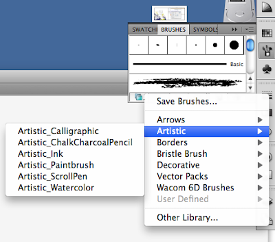
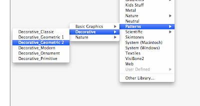
When you open this library, it opens as a blank document, but any brushes you saved are there.
Save over the same library so that you don't end up with 1 million different libraries. Remember to search for free vector/illustrator brushes.

Illustrator notes


Remember - we're starting research first, let this influence the fonts and layout.
Work out how much space you need from the edges of the spine of the book - want at least 1 cm, but be generous with this. Put in margins for each artboard.

Textbox - size of interior margins.

Write up the text for our document by next week.

If document isn't set up properly - file document set up
Type everything into word FIRST - then copy paste.

Command shift 3 gives us a picture of the computer screen.
Problem with screen snapshots - low quality and small.

Put into photoshop, set as CMYK.

Go to image --> image size, - un check all the boxes - tells us how large we can make it. Save this as a jpeg, and then into your linked files.

Remember to place this - file --> place - not copy and paste. This reduces the size. Cross across the image shows that it's placed, rather than pasted.

Find a reference picture for your fashion illustrations, not drawing from scratch. Don't have to copy garment exactly, but can if you want.


Start thinking about how we want this layout to look. Find our fashion image - think about the pose - find someone you're interested in, think about how it uses the background. Remember that these are only used to sketch over - don't bother making it the right size colour etc.
Image has to be at least half to 3/4 body - can be any look, any view.

Reference layer - dimmed and locked so that we don't go over it. Create a new layer for drawing on.

Week Two - notes on assessment one

Booklet - will have many placed images. Don't want to place every image in - this makes it very unmanageable - link files instead.
Press files - our PDFs - this has research document as well as the 2 illustrations. Research document is A5, illustrations are A2.
When using pen tool - make sure that you find a way of doing it that expresses an interesting style, rather than simply tracing - eg, this previous UTS project.

Brushes are used a lot, don't want things to look flat, go outside lines, use gradients etc. For large blocks of text, stick with a standard, easy font. Try not to use handwritten, italic etc in large blocks - hard to read. Keep a consistent look and feel throughout.

Break paragraphs up, people like to read small areas of text. Good contrast between foreground and background.

How do you best want to showcase the artists that you're studying - page showing illustrations? Collage pictures? Keep writing clear, with maybe one picture. Try to avoid the illustration pages looking like cut and paste.

If you're doing light type on a dark background, make sure to make it bigger than you normally would.

Don't need a contents page for this document.

Saturday, August 6, 2011

Tim Walker - this shoot from Vogue Italia March 2010


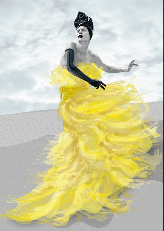
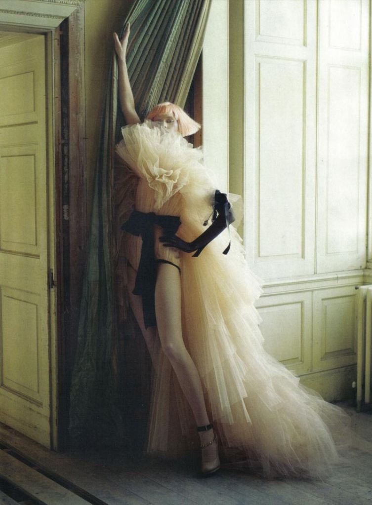
LOVE - the fairytale feel, the poses - so typical fashion, but done in a new and interesting way.
- The use of light
- The fact that these sets are completely real
I would take from this the poses, the background - maybe?

Prince Lauder


Love the mix of mediums again - the splashes of colour on the lips and hair, and the slightly surreal feel to these collage illustrations. These have a much more painterly feel than many other collage pieces, and I like how unstructured they feel, with the seemingly random lines. I think that I could use the combination of flat and lifelike, and black and white and colour on these pieces.